Motivate + NYC Citi Bike
Easing the sign up
While at Motivate, I lead the redesign of the Citi Bike membership sign up web experience for desktop and mobile. A yearly bike share membership is a substantial purchase for most people, therefore the majority of our members sign up through the web instead of our app. Since the web experience is so critical, it was time to look at how to ease the sign up flow.
Project: Citi Bike Membership Registration
Role: Interaction Design, UX
Year: 2017
AUDIT OF EXISTING REGISTRATION
The Citi Bike sign up flow got the job done, kind of, but there was a lot of room for improvement. There was an 83% drop-off rate from users clicking the first page to third page. The experience welcomed users with a long arduous form and it did not scale well to mobile.
The long scrolling page was difficult to navigate, particularly on mobile web.
It was bucketed into three sections, but misled the user as it was heavily weighted on the first.

PRELIMINARY WIREFRAMES
After rethinking the entire registration experience, I fleshed out four different flows - Light Front, Light End, Even and Bookends. These were tested with multiple users to understand areas of frustration and pain points.


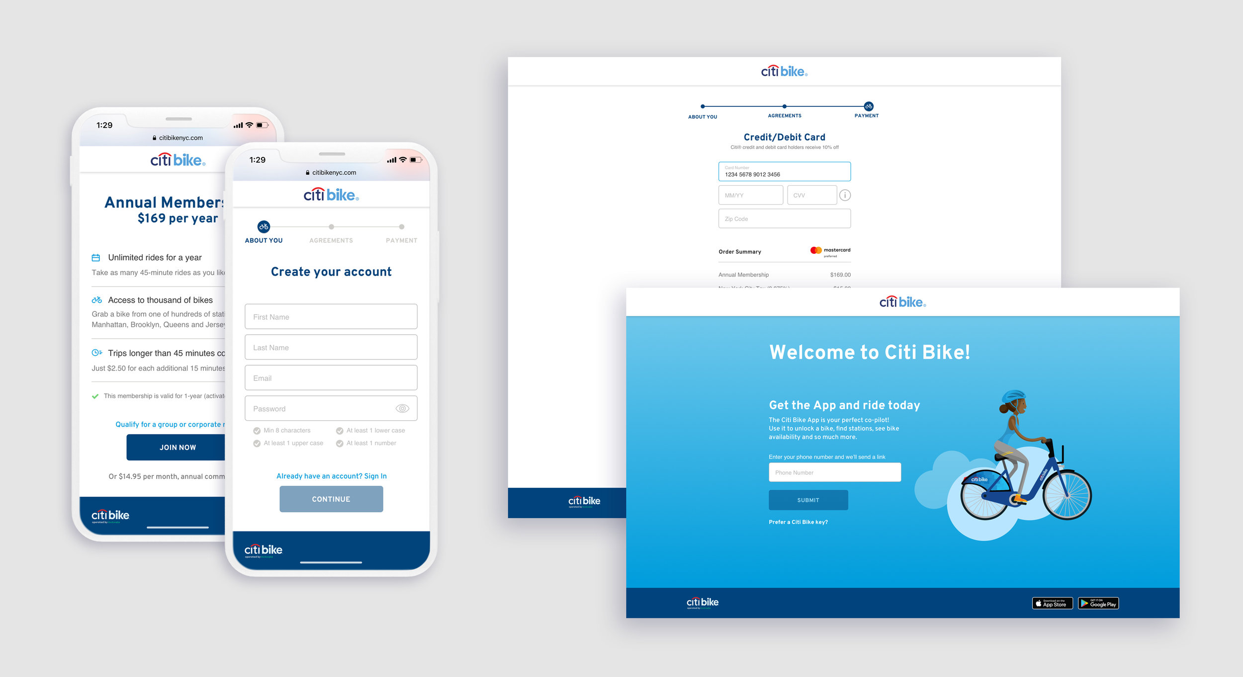
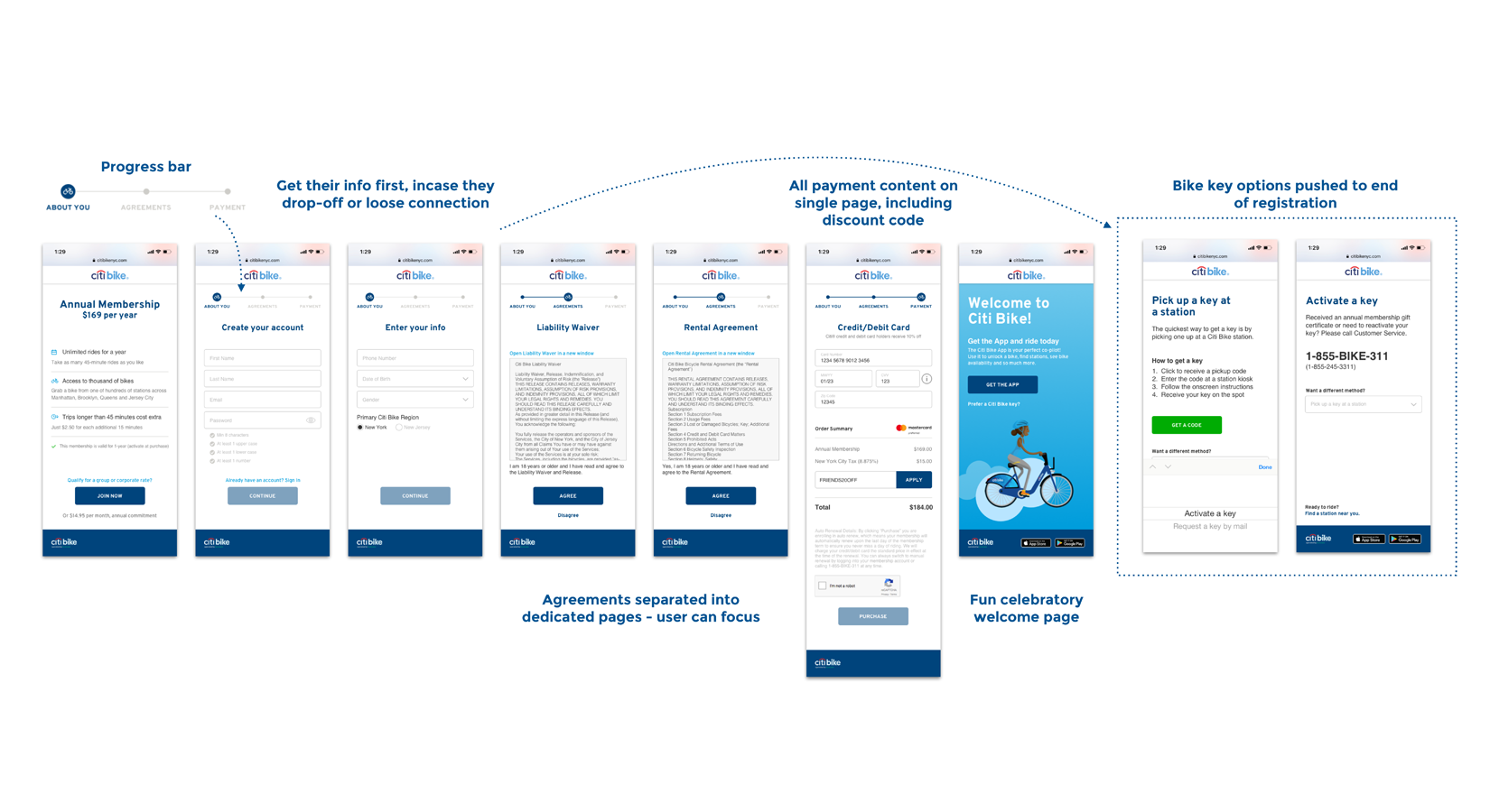
FINAL DESIGNS
User testing resulted with Light Front as the preferred flow, which eased the user into the experience. It was segmented into three “chapters” - About You, Agreements and Payment with a progress bar to alleviate anxiety and mitigate user drop off. The new experience consists of more screens than the original, however there is less content per screen. This decreases cognitive overload, allowing the user to stay focused on the task at hand. Also, the bike key option was pushed to the end as a separate flow to simplify the experience.

POST-LAUNCH RESULTS
Two months after launch, we saw an 8.5% increase in conversion for annual membership registration. The design language is built off of a white label web system, creating consistency while reducing time and effort to launch in other cities such as DC and Minneapolis.
